

Hello,Originally Posted by twitchtoo

First off , thank you for writing this for us. I have question. which version should I install for a site with 1.5.5f and php 5.6 ? I see your latest version is for 1.5.6c. Is there any compatibility issues.
Thread: Column Layout Grid v2.x Support
Results 161 to 170 of 176
-
29 Jan 2020, 05:15 AM #161
 Zen Follower
- Join Date
- Feb 2009
- Location
- atlanta GA
- Posts
- 282
- Plugin Contributions
- 0
 Re: Column Layout Grid v2.x Support
-
29 Jan 2020, 07:40 AM #162
Zen Follower
- Join Date
- Feb 2009
- Location
- atlanta GA
- Posts
- 282
- Plugin Contributions
- 0
Re: Column Layout Grid v2.x Support
Hello,
adding .centerBoxContentsProducts { padding: 1em 0; } to my stylesheet.css has no effect on the product image spacing in product listing. I am using your module on my test site salvagecrate.com and the most current version of your module from the zencart site and zencart 1.5.6c. Please help. I want to add this to my live site but the images for the products seem to be to close to the borders on the top.
-
20 May 2020, 01:06 AM #163
Totally Zenned
- Join Date
- Apr 2007
- Location
- Ontario, Canada
- Posts
- 1,731
- Plugin Contributions
- 27
 Column Layout Grid 3.0 - Twitch Base6 Fork
I did not build the 1.56 version 3.1. Version 3.0 will run properly on 1.55f - php 5.6. It has also been tested up to 1.55f - php 7.2 Originally Posted by jasonshanks
Column Layout Grid 3.0 - Twitch Base6 Fork
I did not build the 1.56 version 3.1. Version 3.0 will run properly on 1.55f - php 5.6. It has also been tested up to 1.55f - php 7.2 Originally Posted by jasonshanks
I am in the process of redeveloping Column Layout Grid 3.0 with Twitch Module compliance for Twitch Base6 as it appears time to fork the module and provide further support to my clients that comes with all Twitch Modules.
Twitch Modules have followed the stable Zen Cart releases for over a decade - to illustrate:
Zen Cart 1.39h > Zen Cart 1.51 > Zen Cart 1.54 > Zen Cart 1.55f > Zen Cart 1.56c
Twitch Modules for any Zen Cart release (1.55a, 1,55b, etc) between those listed above are forward compatible with the stable release.
Looks like this for Column Layout Grid for Product Listing:
Zen Cart 1.39h > CLG - Version 2.31
Zen Cart 1.51 > CLG - Version 2.31
Zen Cart 1.54 > CLG Version 3.0 - twitchtoo - Twitch Wholesale Certified (pre-base standards)
Zen Cart 1.55f > CLG - Version 3.0 - twitchtoo - Twitch Base4 Certified
Zen Cart 1.56c > CLG Version 3.1 - jeking - February 20, 2019
fork
Zen Cart 1.56c > CLG Version ? - twitchtoo - Currently being rebuilt for Twitch Base6 Certification.
I encourage those that want to use jeking's release CLG Version 3.1 moving forward with your stock installation of Zen Cart 1.56 as Twitch Base6 is the newest Zen Cart CMS to be released June 1st to the public.Twitch.
https://www.twitchtoo.com Do you work for free? Please donate.
Twitch Base8 - Obsidian - This, is what's new.
-
25 Jun 2020, 09:29 AM #164
 New Zenner
- Join Date
- Sep 2019
- Location
- United States
- Posts
- 28
- Plugin Contributions
- 0
Re: Column Layout Grid 3.0 - Twitch Base6 Fork
Is there anyway to have this plugin display products in a different number of columns according to screen size?
I'm using Zen Cart v1.5.6c
-
29 Jun 2020, 03:01 PM #165
Totally Zenned
- Join Date
- Apr 2007
- Location
- Ontario, Canada
- Posts
- 1,731
- Plugin Contributions
- 27
Re: Column Layout Grid 3.0 - Twitch Base6 Fork
Originally Posted by mito0930
It currently auto adjusts based on the stock responsive template CSS and the column settings in Admin > Product Listing.
You want a more static or controllable columns per screen based on the mobile devices?Twitch.
https://www.twitchtoo.com Do you work for free? Please donate.
Twitch Base8 - Obsidian - This, is what's new.
-
1 Jul 2020, 09:03 PM #166
New Zenner
- Join Date
- Sep 2019
- Location
- United States
- Posts
- 28
- Plugin Contributions
- 0
Re: Column Layout Grid 3.0 - Twitch Base6 Fork
I want the columns to be more controllable, so that it responds to screen size. Originally Posted by twitchtoo
Currently I have 4 columns shown for desktop and would want 2 or even 1 shown on mobile.
I didn't use the responsive template as framework for my current template (I used classic). Would it be possible to make it responsive like the responsive template or would I have to completely change templates?
-
1 Jul 2020, 09:28 PM #167
Totally Zenned
- Join Date
- Apr 2007
- Location
- Ontario, Canada
- Posts
- 1,731
- Plugin Contributions
- 27
 Re: Column Layout Grid 3.0 - Twitch Base6 Fork
mito0930 - yes. Using the Responsive Template is the first step.
You can see the newest Zen Cart 1.56c - Twitch Base6 for public release running Twitch Product Listing Advanced (Column Layout Grid for 1.56c) here:
https://twitchbase6.com/index.php
And a production version with images, text and the newest features here:
http://barnwoodwine.ca/index.php
I'll be releasing one final Column Layout Grid for 1.56c relative to jeking's last release with these features: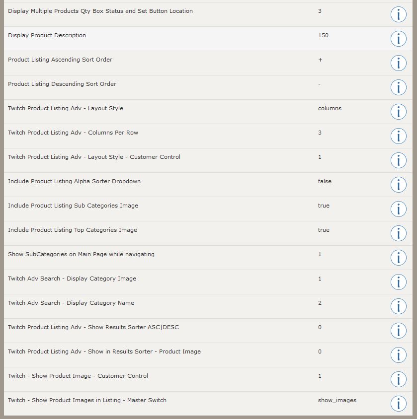
...that looks like this when it's displaying - using the Responsive Template:
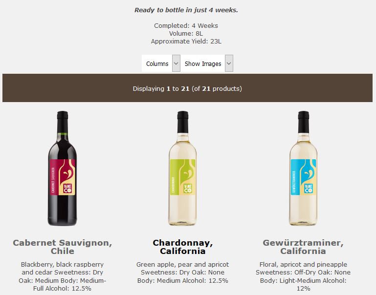
Try both sites out on your various mobile devices and screen sizes on a desktop to see how it will adjust the display Twitch.
https://www.twitchtoo.com Do you work for free? Please donate.
Twitch Base8 - Obsidian - This, is what's new.
-
2 Jul 2020, 02:07 AM #168
New Zenner
- Join Date
- Sep 2019
- Location
- United States
- Posts
- 28
- Plugin Contributions
- 0
Re: Column Layout Grid 3.0 - Twitch Base6 Fork
Twitchtoo, what I'm looking for is something that automatically changes with different screen sizes. Adaptive might be a better word for it, instead of allowing it to be toggled manually. My original question was wondering if I could possibly make this adaptive as described above. I'm not too keen on reworking a brand new template when I've already worked to make one from the classic template. I've made the template as responsive as it can be between desktop, mobile and tablet with specific values. Would I be able to force the number of columns displayed according to those values?
Last edited by mito0930; 2 Jul 2020 at 02:12 AM.
-
2 Jul 2020, 05:03 AM #169
Totally Zenned
- Join Date
- Apr 2007
- Location
- Ontario, Canada
- Posts
- 1,731
- Plugin Contributions
- 27
Re: Column Layout Grid 3.0 - Twitch Base6 Fork
To Clarify...
The stock template already adjusts the columns once you install column layout grid - this happens at the CSS level with a bit of php. The settings for this module allow a baseline control or starting point number of columns before the CSS takes over as the screen sizes change. I've added toggles and master switches to turn on/off display control on the customer side. By default that will maintain the admin selection as a starting point for the template CSS to continue doing what it always has done which is already adaptive/responsive from that perspective. It currently uses a simple equation to divide up the column width by the width set/available within the div it is contained.
If you want to reverse the responsive/adaptive number of columns and control each potential screen size with a static number of columns it would defeat the purpose of the already responsive behaviour but it would ensure that specific screen sizes get paired with specific column counts/sizes.
Alternately...
Leaving the responsive CSS behaviour while forcing say:
- mobile to use only rows with images
and
- desktop/tablet to only show columns with images
Yes it is possible - by simply connecting the mobile detect value to admin selected (or hard coded) toggle positions.
The only drawback is when the automation makes a static decision while the CSS is being dynamic. CSS could be added/adjusted to keep the browser from guessing at the output and overlapping elements on the wrong device.Twitch.
https://www.twitchtoo.com Do you work for free? Please donate.
Twitch Base8 - Obsidian - This, is what's new.
-
2 Jul 2020, 01:37 PM #170
New Zenner
- Join Date
- Sep 2019
- Location
- United States
- Posts
- 28
- Plugin Contributions
- 0
Re: Column Layout Grid 3.0 - Twitch Base6 Fork
Oh, I think I finally understand. I understand that it defeats the purpose, but I realized that displaying 3 columns on a small device makes everything squish together. If that's the case, should I toggle the column grid off and work with the original product listing module code?


 Reply With Quote
Similar Threads
-
Column Layout Grid - Shows only 1 column?
By Marv in forum Templates, Stylesheets, Page LayoutReplies: 7Last Post: 20 Dec 2011, 03:36 PM -
Column Layout Grid 2 products in 4 column display
By Develop&Promote in forum Templates, Stylesheets, Page LayoutReplies: 2Last Post: 8 Feb 2011, 04:26 AM -
Column layout grid for product listing - one column only
By london mummy in forum Templates, Stylesheets, Page LayoutReplies: 15Last Post: 26 Oct 2009, 10:06 AM -
Column Grid Layout on 1.3.7 (single column problem)
By Taipa in forum All Other Contributions/AddonsReplies: 2Last Post: 12 May 2007, 11:44 AM -
Column Grid Layout - trouble with product listing/layout
By mellonade in forum All Other Contributions/AddonsReplies: 1Last Post: 4 May 2007, 11:18 AM

Bookmarks